Introduction
Most readers do not see a book cover at full size first. They see it as a small image on Amazon, a social media post, an online ad, a newsletter, or a mobile screen. If the title is hard to read or the design looks unclear at a small size, the book can lose attention before the reader even clicks.
That is why thumbnail-friendly book cover design has become so important for modern authors. A cover must look attractive in print, but it must also work online where readers scroll quickly and make fast decisions.
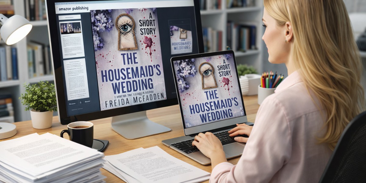
Panda Book Publishing helps authors create professional covers that are clear, genre-aware, visually strong, and ready for both digital and print presentation.
The First Impression Usually Happens Online
Years ago, many readers discovered books by walking through bookstores. Today, many readers first see books through screens. They may scroll through Amazon results, BookTok videos, Facebook ads, Instagram posts, author websites, or email campaigns.
This changes how covers should be designed.
A cover must now work in many places:
Amazon search results
Kindle listings
Social media graphics
Paid ads
Author websites
Online press features
Email newsletters
Book trailers
Mobile screens
Print copies
A cover that looks beautiful at full size may not work well as a thumbnail. The best designs are built to stay readable and recognisable even when small.
Why Thumbnail Readability Matters
Thumbnail readability means readers can understand the title, mood, and genre even when the cover appears small.
If the title disappears, the image looks too busy, or the colours blend together, the reader may keep scrolling.
A thumbnail-friendly cover usually has:
Clear title text
Strong contrast
Simple visual focus
Genre-specific mood
Readable author name
Clean spacing
Balanced typography
Limited clutter
Strong colour separation
The goal is not to make the cover plain. The goal is to make it clear enough to work in real buying environments.
Mobile Readers Need Simple Visual Signals
Many readers browse books on phones. This means the cover may appear very small. A mobile-friendly cover must communicate quickly.
On mobile, readers do not study every detail. They respond to basic signals first:
Is the title readable?
What genre does it seem to be?
Does the cover feel professional?
Does the mood interest me?
Is the image clear or confusing?
A mobile-first design keeps the main message strong. It avoids tiny text, weak contrast, crowded imagery, and fonts that disappear on small screens.
Typography Is the Main Tool for Readability
Typography plays a major role in thumbnail success. The title must be readable in small formats, especially on Amazon and social media.
Good cover typography should be:
Bold enough to read
Matched to the genre
Spaced properly
Balanced with the image
Clear against the background
Easy to read on mobile
Professional in print
A fantasy book may use dramatic typography. A thriller may use sharp and tense type. A business book may use clean and bold lettering. A memoir may use softer, more emotional typography.
The font should support the mood of the book, but it should never become difficult to read.
Strong Contrast Helps Covers Stand Out
Contrast helps the cover catch attention. It separates the title from the background and helps the main visual stand out.
Weak contrast can make a cover look flat or unclear. Strong contrast creates focus.
Contrast can be built through:
Light text on dark background
Dark text on light background
Bold colour difference
Clear subject separation
Simple background space
Strong title placement
This is especially important for online ads and Amazon listings, where several books may appear side by side. A cover with stronger contrast often becomes easier to notice.
Simple Visual Focus Works Better Than Clutter
Many authors want to include every major part of the book on the cover. This can create a crowded design that becomes unreadable at small size.
A strong digital cover often focuses on one main visual idea.
This may be:
A single object
A strong silhouette
A symbolic image
A dramatic setting
A clear character mood
A simple visual metaphor
A clean typography-led layout
A simple focal point makes the design easier to remember. Readers should not have to decode the cover. They should understand the mood quickly.
Genre Still Guides the Design
Thumbnail-friendly design does not mean ignoring genre. The cover still needs to show the right category.
A thriller cover should create suspense. A romance cover should suggest emotion. A children’s book should feel warm and age-appropriate. A business book should feel clear and credible. A memoir should feel personal and meaningful.
Genre signals can come from:
Colour palette
Font style
Image choice
Lighting
Layout
Mood
Symbolism
The design should help readers identify the book’s type in seconds. This makes the cover more useful in online stores and ads.
Covers Must Support Marketing Campaigns
A book cover is not only used on the book itself. It becomes part of the full marketing system.
The cover may appear in:
Launch graphics
Book trailers
Review posts
Author banners
Press releases
Social media ads
Amazon ads
Email campaigns
Website sections
Podcast feature graphics
If the cover is not clear, every marketing asset becomes weaker. A strong cover gives the campaign a professional centre. It helps readers recognise the book across different platforms.
Print Quality Still Matters
Even though digital visibility is important, print presentation should not be ignored. A cover should look good as a physical book too.
For print, designers must think about:
Spine readability
Back cover layout
Blurb placement
Barcode space
Trim size
Bleed area
Colour quality
Paper finish
Full wrap design
A strong cover should feel polished online and in the reader’s hands. The digital and print versions should work together, not compete.
Common Thumbnail Cover Mistakes Authors Should Avoid
Using Thin Fonts
Thin fonts may look elegant at full size but disappear in small previews.
Adding Too Much Text
A cover should not include too many subtitles, taglines, or design notes. Too much text can weaken readability.
Choosing Low-Contrast Colours
If the title blends into the background, readers may not notice the book.
Making the Image Too Detailed
Small details often disappear in thumbnails. One clear visual is stronger than many tiny elements.
Ignoring Online Store Layouts
The cover should be tested in small sizes before final approval. Authors should check how it looks on mobile, social media, and retailer pages.
FAQs
What is thumbnail-friendly book cover design?
Thumbnail-friendly book cover design means creating a cover that stays readable, clear, and attractive when shown as a small image online.
Why does thumbnail readability matter?
Most readers first see books online in small previews. If the title or design is unclear, the book may lose clicks.
What makes a book cover readable on mobile?
A mobile-readable cover uses clear typography, strong contrast, simple imagery, balanced spacing, and genre-specific design signals.
Should the cover be designed for print or digital first?
A strong cover should work for both. However, because many readers discover books online first, digital readability should be considered early.
Can a simple cover still look professional?
Yes. Simple covers can look very professional when the typography, spacing, colours, and visual focus are handled well.
Conclusion
A book cover must do more than look good at full size. It must work where readers actually see it first: online stores, social media, mobile screens, ads, websites, and email campaigns.
Thumbnail-friendly design helps authors make a stronger first impression. Clear typography, strong contrast, simple visual focus, genre signals, and mobile readability can help a book stand out in crowded digital spaces.
For authors who want a cover that works in print and online, Panda Book Publishing provides book cover design support built to make books look clear, professional, and ready for modern readers.